Unlocking Visual Insights: A Comprehensive Guide to Mastering the Pie_chart: Techniques, Best Practices, and Design Aesthetics
Introduction:
In the realm of data visualization, pie charts hold a strategic position, playing a pivotal role in understanding and presenting complex data in an easily digestible format. This article aims to explore the ins and outs of pie charts, including effective techniques, best practices, and design aesthetics, unlocking deeper insights and enhancing the overall clarity of the information presented.
Understanding the Pie Chart:
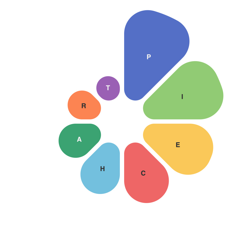
Pie charts represent a dataset in which each category’s proportion to the whole is depicted through a slice of the pie, with the total sum of these slices equalling 100%. Originally developed by William Playfair in the late 18th century, they continue to serve as a visually appealing and effective means of presenting data.
Effective Techniques:
1. **Limiting Categories**: Pie charts are most impactful when they display a limited number of categories. Ideally, a pie chart should not contain more than 5-7 slices to ensure each category receives adequate visual weight and can be easily understood by the viewer.
2. **Sorting Slices**: Arrange the categories in descending order of size to facilitate easier interpretation. Highlighting the largest or most significant slices can draw attention to key data points without overwhelming the chart.
3. **Appropriate Size and Space**: Ensure each slice has a reasonable size to maintain readability while avoiding clutter. Ensure there’s enough space between slices for differentiation, especially when adjacent categories have similar values.
Best Practices:
1. **Use of Colors**: Employ distinct colors for each category to differentiate them easily. Avoid using overly bright or contrasting colors that can strain the viewer’s eyes. Ensure there is enough color contrast, especially in printed forms to aid color vision difficulties.
2. **Labeling**: Clearly label each slice with the category name and, if necessary, the percentage or numerical value it represents. Placing labels outside the chart to limit the distortion of the slice’s accuracy can help maintain clarity.
3. **Avoiding 3D Effects**: 3D or exploded pie chart effects can distort the perception of the slice sizes making it harder for viewers to accurately interpret the data. Opt for a flat 2D design to preserve the integrity of data representation.
Design Aesthetics:
1. **Minimalist Approach**: Focus on simplicity and clarity, reducing unnecessary chart elements that do not contribute to the understanding of the data. Avoid excessive borders or embellishments.
2. **Consistency**: Keep your design consistent with the broader visual style guide of your document or project, ensuring a cohesive presentation of information.
3. **Accessibility**: Consider color blindness and ensure that your chart can be understood and effectively used by all audiences. Implement guidelines such as providing text labels, using patterns, or offering alternative representations.
Conclusion:
Mastering pie charts combines the art of data presentation with the science of visual communication, enabling the creation of impactful, reader-friendly visualizations that unlock deeper insights from your data. By adhering to the techniques, best practices, and design aesthetics discussed in this article, you can harness the full potential of pie charts to communicate your message accurately and effectively. With a thoughtful approach to design, you can make pie charts a powerful tool in your data visualization arsenal.

