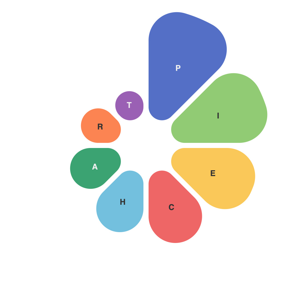
Unlocking Visual Insights: Mastering the Art of Creating Compelling Pie Charts
In an era where data visualization reigns supreme, effectively communicating information has become an essential skill, particularly in business, education, and even personal projects. Among various graphic representations, pie charts command attention for their simplicity and ability to convey proportions at a glance. Mastering the art of creating compelling pie charts is not just about presenting data; it’s about inspiring action, making complex information accessible, and adding a professional touch to your analytics.
### Understanding Your Data
Before delving into pie chart creation, start with a clear understanding of your data:
1. **Purpose of the Chart**: Ask yourself what story the chart aims to tell and what decisions you hope to influence.
2. **Audience**: Consider the background and level of expertise of your audience to tailor the level of detail and complexity.
3. **Data Range**: Evaluate whether the categories can be meaningfully categorized and whether you can effectively distinguish between major and minor parts without causing visual clutter.
### Design Principles for Effective Pie Charts
**Simplicity**: Start with a clean design, avoiding excessive colors or decorations. This not only enhances readability but also directs the focus on the data.
**Proportion Visualization**: Use pie charts when the comparison of parts to a whole is your primary focus. Ensure slices are large enough to be discernible at a glance, typically aiming for slices larger than 10%.
**Color Coding**: Use distinct, but harmonious colors to differentiate between slices. Ensure that color schemes are accessible and consider color blindness when choosing colors.
**Legends and Labels**: Always provide labels within the chart for clarity, especially if space allows. Avoid overcrowding text; use concise labels that accurately describe each slice. Legends are the last resort.
### Making the Pie Chart Pop
**Use a Grid**: Apply a simple grid in the background to act as a reference, which can help viewers gauge angles and sizes more effectively.
**3D Effects**: While 3D effects might seem tempting, they can often distort perception and make the chart harder to accurately interpret. Stick to 2D representations unless they are specifically designed to meet a unique visual demand.
**Exploded Slices**: Exploding a slice can emphasize a particular theme or highlight a category that requires additional attention, but use this sparingly and with intent; it can also create confusion when used excessively.
**Interactive Elements**: For digital pie charts, if space allows, incorporate hover-over or click-through features to provide additional information without cluttering the main visual.
### Example: A Marketing Campaign Analysis
Imagine crafting a pie chart for a digital marketing campaign performance. Here, visual insights could quickly highlight the most and least effective channels. The chart should be easily readable, with distinct colors assigned to each channel, large enough labels to understand percentages at a glance, and a non-exaggerated 3D effect that enhances readability rather than deceiving it.
### Final Tips
– **Consistency**: Use consistent chart styles and formats within a report or presentation to maintain clarity and professionalism.
– **Testing**: Before finalizing any chart, test its readability and impact with a few peers or stakeholders to ensure it communicates effectively.
– **Adaptation**: Be prepared to refine and adjust the chart layout based on feedback and always aim to simplify information for the greatest impact.
Creating compelling pie charts is not just about presenting data beautifully; it’s about effectively communicating insights that drive action. By understanding your data, adhering to design principles, and being mindful of your audience, you can unlock powerful visual insights that tell stories beyond mere numbers.

