Pie Charts in Data Visualization: Mastering Insights Through Visual Analysis
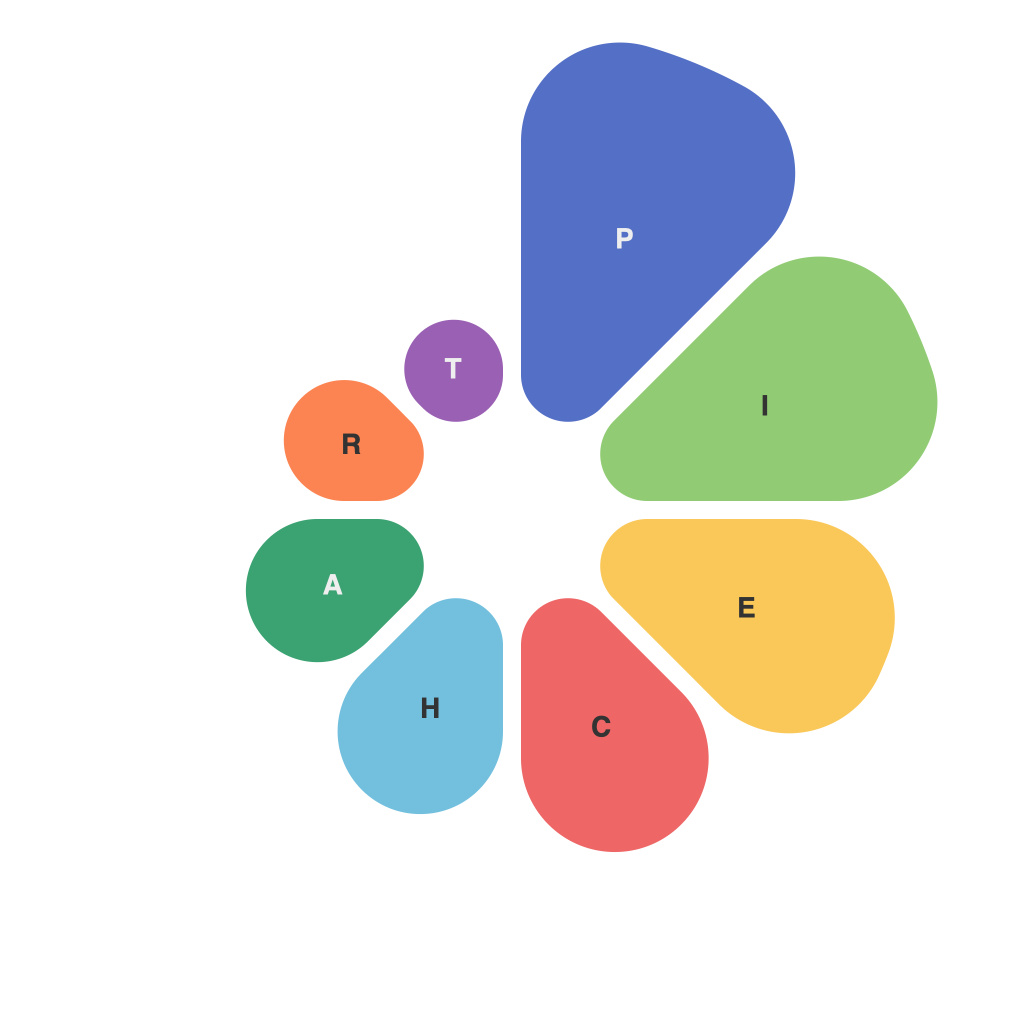
Pie charts have been a staple of data visualization since the 17th century, with their first appearance attributed to William Playfair. These circular charts, divided into sectors known as slices, offer a visual way of understanding proportions and percentages within a dataset. The beauty of pie charts lies in their simplicity and the ability to convey complex information in an immediately understandable format. However, mastering pie charts for effective data visualization requires a keen understanding of their limitations and the ability to present data in the most meaningful way.
**Understanding Pie Charts**
Pie charts are ideal for displaying parts of a whole, making them particularly useful when visualizing data categories that sum up to a total. They excel at showing how each category contributes to the total, making it easy for viewers to grasp the relative sizes of data groups at a glance. This makes them especially suitable for representing data in industries such as business, where stakeholders need to quickly understand market share, sales distribution, budget allocation, or demographic profiles.
**Best Practices for Creating Effective Pie Charts**
– **Limit the Number of Slices**: Too many slices can make a pie chart cluttered and difficult to interpret. Experts suggest aiming for five or fewer sections, though this can depend on the context and need for detail. When necessary to include more categories, consider redesigning the chart type, utilizing a stacked bar chart or a diverged stacked bar chart, which offer clearer comparisons between categories and their components.
– **Order and Emphasis**: Arrange slices, typically in a clockwise direction, from largest to smallest for logical sequencing. This aids in comparing the sizes of different categories and retaining viewer interest. If a key category differs significantly from others, it can be placed first to ensure it receives the prominence it deserves.
– **Use Solid Colors**: Choose distinct and solid colors for each slice to enhance readability and visual separation. Avoid using very similar colors for adjacent slices, or data might blend together or become confusing. Bright and contrasting colors can help highlight critical data points.
– **Proper Labeling**: Accurate and clear labels are essential for pie charts to convey meaningful insights. Include labels directly on the slices, especially if the size of the slices varies significantly. It’s also important to denote the exact percentages or values of each slice, either directly or in a separate legend. This ensures that viewers can easily grasp the composition of the data.
**Overcoming Challenges**
– **Misleading Comparisons**: When slices are close in size, pie charts can make it difficult for viewers to distinguish between values, potentially leading to misinterpretation. Consider using other chart types, like bar charts or line graphs, in such scenarios.
– **Excess Complexity**: Don’t use pie charts in cases where the detailed comparison of categories is more important than the part-whole relationship. In these situations, pie charts can obscure the underlying data and lead to confusion.
– **Space Constraints**: Pie charts can be unsuitable for small screens or limited spaces, where they can be difficult to interpret. In such settings, consider alternatives like donut charts, which offer more flexibility in spatial usage and potentially clearer visual distinction.
**Conclusion**
Pie charts remain a valuable tool in the data visualization arsenal, especially when their simplicity and intuitive nature play to the strengths of the data or situation. By following best practices, addressing inherent challenges, and knowing when to use or substitute alternative chart types, practitioners can effectively unlock the full potential of pie charts in communicating insights and making data-driven decisions.

