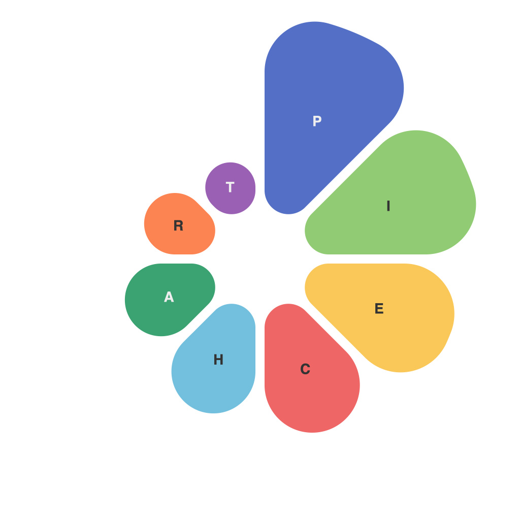
Unlocking Visualization Potential: A Comprehensive Guide to Mastering Pie Charts
Pie charts are a simple yet impactful visual tool for presenting data in a manner that’s easily perceptible at a glance. They offer a straightforward method to compare parts of a whole, making them a common preference in business presentations, research publications, and media sources. However, mastering pie charts to maximize their utility and clarity does require an understanding of the principles behind designing these visual displays. The article below delves into the comprehensive guidelines on mastering various aspects of pie charts to help unlock their full potential.
### Understanding the Fundamentals
Before diving into the specifics of crafting effective pie charts, knowing their basic components is crucial:
1. **Sectors**: Each distinct slice of the pie represents a category or data point. The size of each sector visually corresponds to the proportion of the total that the data point represents.
2. **Chart Label**: This provides the numerical value of each sector, often as percentages or absolute values, to offer quantifiable context to the visual information.
3. **Legend**: In cases where pie charts overlap or sectors cannot be easily labeled, a legend can help viewers quickly match colors or patterns to the corresponding categories.
### Criteria for a Successful Pie Chart
To ensure that your pie charts effectively communicate their intended message, consider the following suggestions:
1. **Keep It Simple**: Pie charts work best when dealing with a limited number of categories. Typically, five or fewer categories are recommended for clarity. More than seven categories may make the chart difficult to interpret.
2. **Sort Logically**: Arrange the slices in a way that makes sense, usually starting with the largest pieces at the top and moving clockwise. This facilitates easier comparison between categories.
3. **Use Consistent Colors**: Use distinct but also consistent colors to represent different categories. Avoid using solid colors when legends are used, as it can make differentiation difficult.
4. **Add Text Labels**: Ensure every slice has a label with the category name if it’s too small for a legend. This greatly improves readability and understanding, especially when sectors are too small to label individually.
5. **Don’t Overuse Percentage Circles**: Though useful, percentage circles can clutter the chart, especially when combined with labels. Strive for simplicity and clarity.
### Effective PIE C H A R T I N S I G N T H I N G S
Incorporating specific techniques and design best practices can significantly enhance the effectiveness of pie charts:
– **Slice the Large Pie**: Make the largest slices more prominent by adjusting their size or adding borders, ensuring they stand out instantly, drawing attention to the most significant contributors.
– **Utilize Legends Wisely**: Legend placement can impact readability. Consider placing it efficiently to avoid overlapping with categories or important text labels.
– **Incorporate Annotations**: Add notes or comments next to specific slices of the pie chart. This can provide context and highlight key insights the chart is intended to convey.
– **Consider Alternatives**: Though pie charts are common, they may not always be the most effective choice, especially for showing trends over time or comparing data across categories in detail. Consider alternative charts like bar charts or stacked bar charts, line charts, or even tables, depending on the data and the message you want to communicate.
### Conclusion
Mastering pie charts requires a balance between artistic and analytical skills. By ensuring clarity, simplicity, and the strategic use of color and labels, you can significantly enhance the effectiveness of your pie charts. Remember, the goal of any chart, including pie charts, is to make complex information accessible and understandable. Following the guidelines outlined in this guide should facilitate a more informed and impactful use of pie charts in your data visualization efforts.

