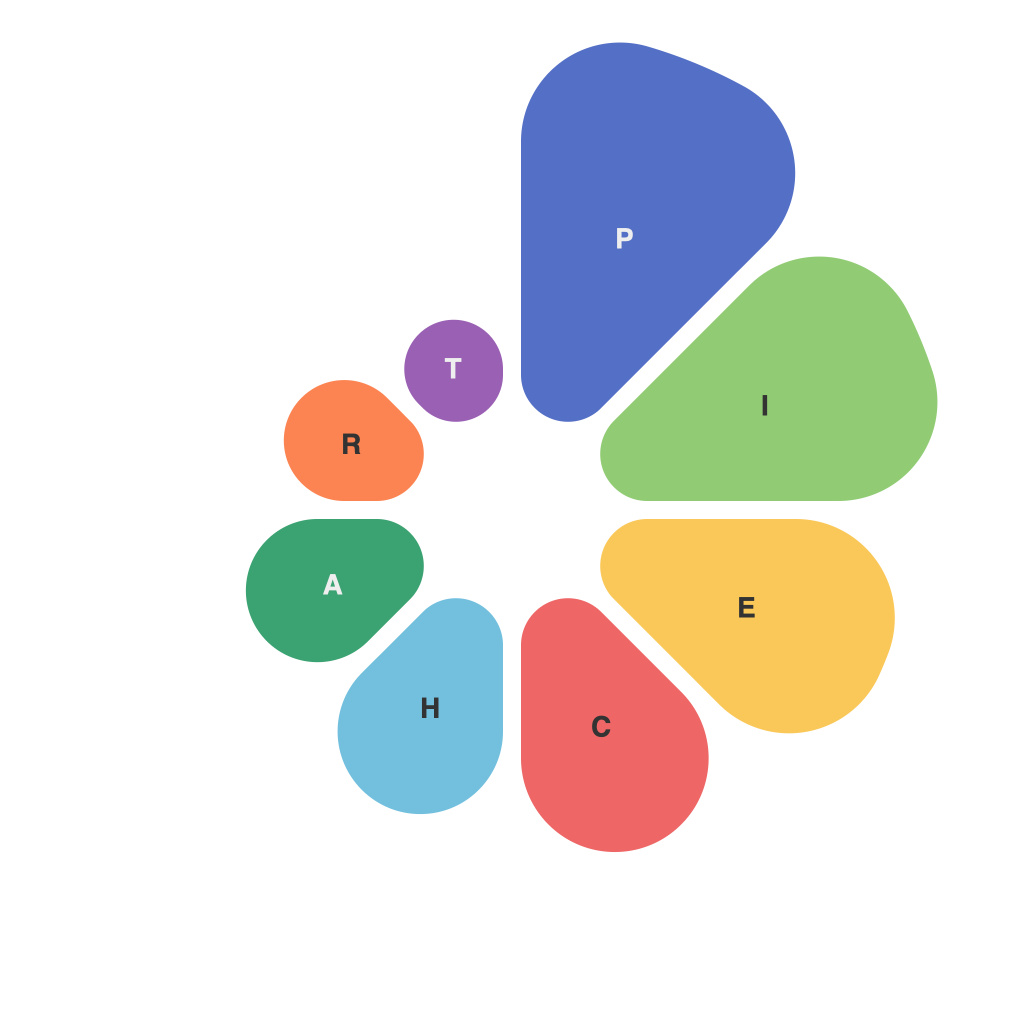
Visual languages have evolved into a staple for communication, helping individuals from various backgrounds understand complex information at a glance. One of the iconic tools in this visual language arsenal is the pie chart—a simple yet powerful data representation method. By peeling back the layers of its creation, distribution, and interpretation, we can better understand the art and science behind this essential data visualisation.
**The Genesis of Pie Chart Design: Art or Science?**
The pie chart, born of the early 20th century, is a product of several intersecting disciplines—statistics, design, and communication. The idea began as a scientific tool, allowing statisticians like William Playfair to represent large sets of data in an accessible format. Yet, its design and construction are more akin to an art form.
The art of pie charts lies within their ability to encapsulate a story, to make connections, and guide the viewer to insights with a single glance. It is an iterative process that requires a delicate balance between simplicity and information, between the visual and the numerically precise. Artisans of data—chart designers—must decide how to slice the pie and, more importantly, how to display this data with precision.
**Cutting Through Complexity: The Artistry of Slicing the Pie**
One key aspect of pie chart design is understanding the best way to segment the pie. Depending on the data and context, it might appear straightforward, but the slicing process is where the artistry truly reveals itself.
Pie charts are often used to compare parts to a whole, so the division by four quarters isn’t always the way to go. Designers must consider the following artful decisions when slicing the pie:
– **Number of Sections**: Too many slices can make the chart difficult to interpret, while too few may oversimplify the data.
– **Size Order**: Placing the largest slice next to the largest number is intuitive, but what about the less intuitive? Choosing the right size order can enhance the viewer’s understanding.
– **Angle**: Equal sections have more distinct shapes but can be difficult to fit neatly into any orientation. Designers must balance the shapes with the desired flow of information.
**The Science of Color: Enhancing the Pie Chart’s Narrative**
Color is another element that contributes to both the art and science of pie charts. Color helps direct the viewer’s attention, emphasize trends, and even communicate emotions or cultural cues. Yet, in data visualization, color selection requires a careful balance:
– **Consistency**: Using a distinct color for each pie slice can help the viewer differentiate sections, but it needs to be consistent throughout the chart.
– **Visibility**: Contrasting the colors that enhance readability without overwhelming the chart’s readability is key. Too many colors can distract from the data’s key message.
– **Cultural Implications**: Be mindful of cultural sensitivities; what might seem like a beautiful shade of green in one culture could have negative connotations in another.
**Pie Charts in a Nutshell: Insights and Limitations**
As versatile as pie charts can be, they are not without their limitations. Pie charts can be misleading if the viewer is unable to discern the differences in sections when they are of similar size. Additionally, complex data sets with more than four segments can result in a visual cacophony rather than a coherent narrative.
Pie charts are perfect for a first look at data—they tell a quick story, allow for comparisons between parts and the whole, and foster deeper conversations. When used correctly, they serve as a window into the numerical world, inviting us to explore deeper into the information we’re presented with.
The true magic of pie charts lies in the harmony achieved between their artistic and scientific qualities. It is a fine balance that can enlighten and engage, providing data with not just a voice, but an impactful one. Whether it’s a decision on a business’s strategy, a summary of election results, or a review of a project’s progress, the pie chart stands as a testament to the power of conveying data in a way that is both visually compelling and scientifically rigorous.

