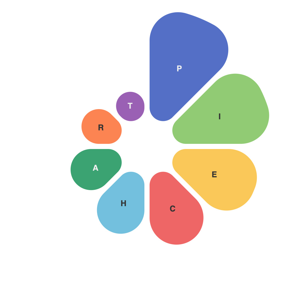
In the realm of data representation, pie charts have emerged as a quintessential tool for conveying the division and proportion of whole data sets or groups within a larger dataset. This article delves into the intricacies and nuances of pie charts, offering a visual guide that elucidates their use, best practices, and limitations.
### The Simplicity of Proportions
At their core, pie charts are designed to illustrate the relationship between different parts and the whole. By breaking down a category into sections, each representing a component with varying sizes, pie charts make it easy to perceive proportions at a glance.
The classic format features a circle, which symbolizes the total amount or value (in many cases, a population or total sales). Each pie slice, or segment, then represents a portion of this whole, with the size of the slice corresponding to its proportion in the dataset.
### Crafting a Compelling Pie Chart
Creating an effective pie chart can be achieved through the following steps:
– **Selection of Appropriate Data**:
Ensure that the data is categorical or suited to being presented proportionally. Avoid using pie charts for comparing numerical values, where bar charts or line graphs may be more adequate.
– **Limiting the Number of Slices**:
A rule of thumb in pie chart design is to avoid having too many slices. With too many portions, pie charts can become visually overwhelming and difficult to interpret. Six or fewer slices is typically recommended.
– **Balancing the Size of Slices**:
While larger slices can be more visually dominant, they don’t always signify a statistically significant difference. Strive to balance the size of slices for improved comprehension.
– **Using a Clear Color Scheme**:
Different colors can be utilized to distinguish between slices, but a consistent color scheme should be employed to avoid confusion. It also helps in making it easier for colorblind users to differentiate them.
### The Power of Customization
To make pie charts more effective and engaging, some customizations can be applied:
– **Adding Legend**:
A well-designed legend is crucial; it provides the context necessary for readers to understand each slice’s category without referring back to the dataset.
– **Implementing Gradient or Hatching**:
Utilizing gradients or hatching to differentiate similar colors can be a subtle yet effective way to enhance comprehension.
### Best Practices
When integrating pie charts into your visualizations, consider the following best practices:
– **Emphasizing Key Elements**:
Highlight the slice that represents the most significant proportion to draw reader attention.
– **Including Labels**:
Label the largest slices to ensure that viewers can immediately identify them.
– **Comparing to Baseline Data**:
For comparative purposes, a pie chart of a different time period or scenario can be overlaid or side-by-side for a quick apples-to-apples analysis.
### The Downside
Despite their benefits, pie charts come with limitations:
– **Circular Distortion**:
Due to their circular nature, pie charts can distort perceptions. The angles between slices that look similar can differ significantly in actual proportion, making it challenging to be precise about exact values.
– **Complexity with Increasing Numbers**:
As the number of slices increases, the pie chart can become disorienting, and readers may struggle to discern finer differences among segments.
### Conclusion
Pie charts are an invaluable tool in data representation that can offer a quick visual representation of proportions within a dataset. When crafted with care and purpose, they can be both engaging and informative. However, understanding the limitations and applying best practices will ensure that these图表 truly shine as a beacon of clearer data insight.

